What Is a CTA in Marketing: How to Create Calls to Action That Work

Imagine visiting a website, finding the product you want, and deciding to place an order — only to discover there is no “Buy” button. Or maybe there is one, but it is hidden somewhere at the bottom of the page and simply says “Submit.” Frustrating, right?
Together with the SwiftCallback team, we looked at how to create effective CTAs that help you avoid losing valuable customers.
What Is a CTA, Where Is It Used, and How Should It Be Adapted to Different Formats?
A CTA (Call to Action) is a marketing message that encourages people to make a purchase, subscribe, call, or take another specific action. It can appear anywhere a brand communicates with its audience.
SwiftCallback Services
✔ We automate callback requests and connect customers with your team quickly
✔ We help you identify which campaigns generate the most qualified leads
✔ We provide clear analytics and make your sales process more efficient
Where CTAs are used and why:
- On landing pages and websites — to encourage users to make a purchase or submit an inquiry.
- In emails — to direct users to a website, offer downloadable content, or encourage them to use a promo code.
- On social media — to engage the audience in conversations, encourage them to follow an account, or visit a link.
- In offline materials — for example, outdoor ads can direct people to a store website or promotional landing page.
The same call to action can perform differently depending on the channel.
It is important to consider the context in which users interact with your brand. On a landing page or in an email, users are usually already interested and focused. On social media, however, their attention is much more divided.
On a landing page, where the user has already explored the product, you can use direct wording such as “Sign Up.” However, if the price is relatively high, offering an alternative such as “Request a Consultation” may work better. During the conversation, you then have the opportunity to explain the offer and encourage the customer to make a purchase.
In emails, the CTA should be visible and easy to understand. The text can be short and creative or slightly more detailed if you want to highlight the value of the offer. The most important thing is that your audience immediately understands it.
If someone is receiving your email, they probably already know your brand. This means you can — and should — be more specific. Do not be afraid to use slightly longer wording when it clearly communicates a benefit. For example, “Download the Guide with 10 Ready-to-Use Scripts” is stronger than simply “Download the Guide.”
❗️Important: consider which device your audience uses most often to interact with your content. On mobile devices, buttons should be large enough and have enough surrounding space to be tapped easily with a finger.
On social media, especially when communicating with a new audience, highly sales-focused phrases can feel too aggressive. It is better to use more relaxed and engaging wording, such as “Watch the Video Analysis” or “Share Your Thoughts in the Comments.”
Avoid using CTAs that send people to external sources unless it is really necessary. In most cases, users do not want to leave the social media platform they are browsing, so it is often better to keep the interaction there.
In offline marketing, a CTA needs to make sense even without detailed context. Flyers, for example, work well when they combine a clear benefit, simple conditions, and an easy way to take action. For example: “Get €15 Off Orders Over €75 with Promo Code SB25,” followed by a QR code that leads directly to the website.
This saves people time and immediately tells them what they receive, under what conditions, and where they need to go to claim the offer.
How to Write a Good CTA
An effective call to action is a carefully written phrase that encourages people to take the next step while making that step as easy as possible.
Start with your goal. What do you want the user to do: buy, subscribe, download something, or leave their contact details? Your goal determines the verb, tone, and level of detail you should use.
For example:
- “Download the Guide” for useful content.
- “Buy with a Discount” for a sales offer.
- “Register for the Webinar” for engagement.
Next, consider the context. As mentioned earlier, direct CTAs such as “Buy Now” or “Submit a Request” can work well on landing pages. On social media, where the audience may only be discovering your brand, a softer approach is usually better.
Social media requires a different strategy because users are simply scrolling through their feeds and are not necessarily ready to buy anything. They may not even know your brand — the algorithm may have simply shown them your post.
In this case, the CTA should be light and short, or it can use an emotional hook.
You can increase motivation by focusing on elements such as:
- Urgency — “15% Off Today Only.”
- Scarcity — “Only 3 Spots Left.”
- Benefit — “Download for Free and Start Saving.”
- Social proof — “More Than 500 Customers Have Already Joined.”
Check for clarity. A CTA should be short and easy to understand. Ideally, it should contain between two and six words.
Instead of a vague phrase such as “Learn More,” use something specific, for example, “View the Door Catalogue.” Users will immediately understand what they will see after clicking.
And, of course, the CTA should logically continue the message and match the expectations created by the content.
Remember: these examples are not fixed rules. CTAs should always be adapted to your channel, audience, and objective.
Common CTA Mistakes and How to Fix Them
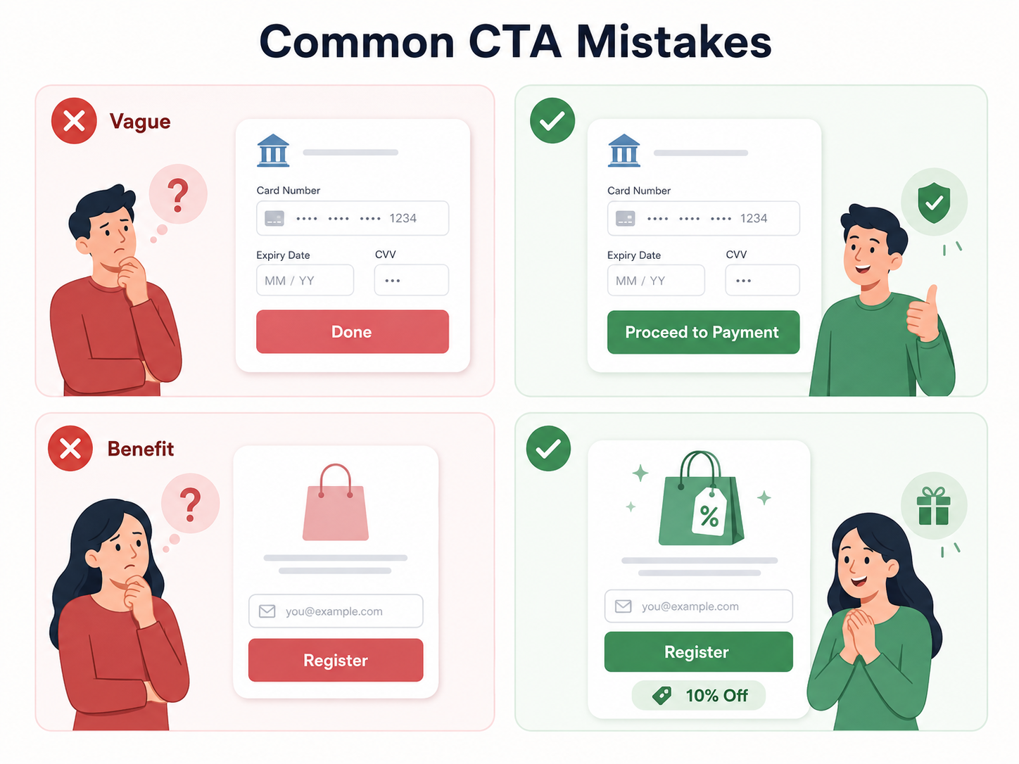
❌ Vague wording. Imagine completing an online banking form and seeing a button that simply says “Done.” It is not clear what happens next. Will you move to another step? Will a payment be processed? Will something else happen?
Because of this uncertainty, users may go back to check the information or simply abandon the process.
✅ How to fix it: clearly explain what happens next. Instead of “Done,” use something like “Proceed to Payment” or “Submit Application.”
❌ An unclear benefit. Users may not understand why they should take action now. For example, a button may simply say “Register” without providing any additional reason to do so. However, registration could actually include a benefit such as a discount on the first order or free delivery.
✅ How to fix it: highlight the benefit. If there is not enough space on the button itself, use a pop-up or supporting text to communicate it.
Pop-Ups
Show customers an attractive offer at the right moment.
❌ A CTA that does not match the content. A call to action becomes less effective when it does not logically follow what the user has just seen.
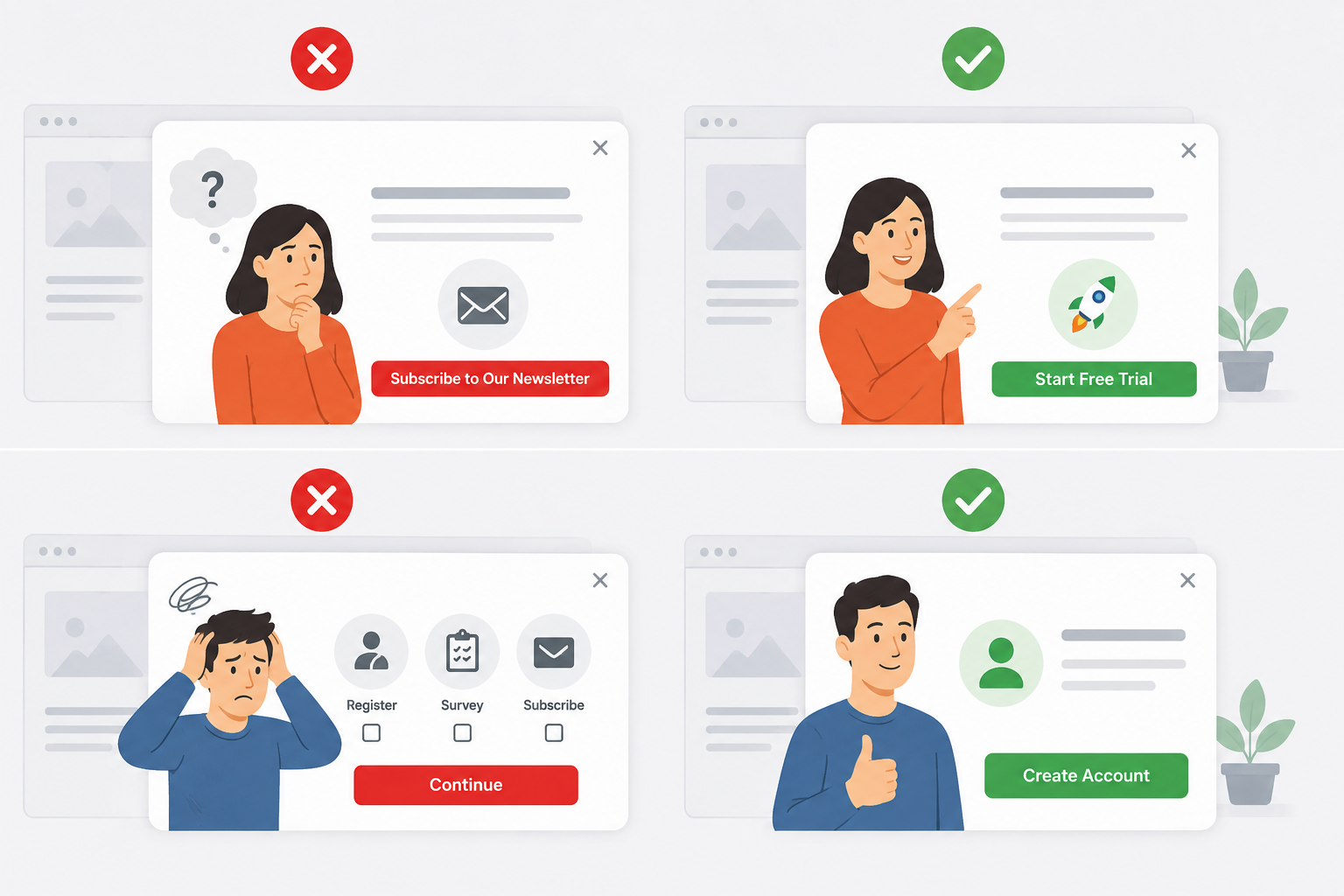
For example, someone reads about a service and decides they would like to try it, but the button says “Subscribe to Our Newsletter.” This interrupts the natural customer journey and takes the user away from the action they were ready to complete.
✅ How to fix it: create a CTA that naturally leads to the next step. After presenting pricing plans, offer a free trial. After explaining the advantages of a product, give users the option to add it to their cart.
❌ Too many actions at once. If you ask users to do several things at the same time — register, complete a survey, and subscribe — they may ignore all of them. Too much information divides their attention and can lower conversions.
✅ How to fix it: choose one main CTA for each page. Ask yourself: “What is the most important action I want the user to take right now?” Keep that action as the main focus and offer the others later.
How to Measure CTA Performance
To understand whether a CTA actually works, you need to rely on data rather than intuition.
Run A/B tests. Create two versions of a button or link and change the text, colour, size, or position. Split the traffic evenly and measure which version generates more clicks or conversions.
Test only one element at a time so you can clearly identify what influenced the result.
The Complete Analytics feature from SwiftCallback helps you track not only clicks, but also the entire customer journey leading to an inquiry.
MultiTracking
- Tracks calls, inquiries, and emails generated by advertising.
- Shows which ads bring in customers.
- Helps optimise advertising campaigns.
Use heatmaps. Heatmaps show where users click and how they move their cursor around the page. If your CTA is located in a “cold” area, users may simply not notice it or may not find it attractive enough.
Try changing its position or making it more visually prominent.
Web analytics tools can also show where and when people click, and some can even provide session recordings of how users interact with your website.
Track key metrics. At a minimum, monitor CTR and conversion rate.
- High CTR but low conversion — the CTA attracts attention but does not match user expectations.
- Low CTR but high conversion — the button may not be visible enough.
It is also worth looking at scroll depth and user retention.
Analyse results over time. Data from a single day can be misleading. Compare performance over at least one week to reduce the impact of holidays, seasonal changes, or unusual traffic patterns.
Key Takeaways About CTAs in Marketing
A well-written call to action helps users take the next step without unnecessary pressure. It is relevant, clear, and naturally continues the conversation.
Remember, a strong CTA:
- Clearly explains what happens after the click.
- Appears when the user is ready to take action.
- Matches the expectations created by the text or design.
- Offers a real and tangible benefit.
*Visual content notice: Some images and interface mockups used in this article were created with the assistance of AI for illustrative purposes.
Articole similare
- SwiftCallBack in Practice: Recovering Missed Calls, Tracking Leads, and Optimising Campaigns — To make better marketing decisions, it is not enough to know how many users have submitted a form on a website. It is equally important to identify all the channels through which customers contact us, including the…
- Influencers: Who They Are, Why Brands Need Them, and How to Work with Them — Influencer marketing is no longer something used only by large brands. Today, local cafés, small shops, and beauty salons also work with influencers to reach potential customers more easily. The reason is simple…
- Viteza site-ului: cum influențează vânzările și cererile de contact — Un vizitator ajunge pe site-ul tău pentru că este interesat de un produs sau de un serviciu. Poate a accesat o reclamă, te-a găsit pe Google sau a primit o recomandare. Înainte să citească oferta și să decidă dacă vrea…